International Programs Website Redesign
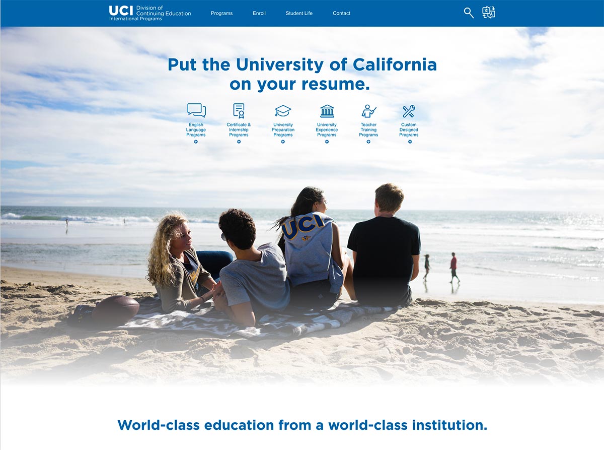
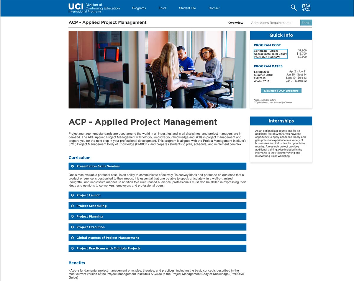
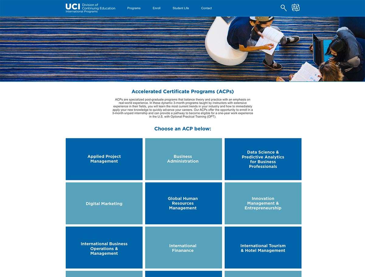
In my brief stint with UCI Continuing Education’s marketing team, I was asked to take a look at the current international website and think of ways to improve it visually. The site in its current state looked very dated, and it was difficult for people to navigate from place to place (particularly international students).
Before I could start implementation, I was moved over to the instructional design branch of Continuing Education, thus ending the project. However, before I moved, I was able to create some prototypes that I think captured the design we were going for.
Below you can see screenshots of my prototypes, as well as a few screenshots of the current design (as of 9/24/18). I worked in Adobe XD, so if you’re interested in going through that file, click the button below.


